Nine Models, Two Results
- evals
- llm
- statistics
- ranking

A ranking finished on my machine last week. Nine models, fourteen prompts, 960 head-to-head judgments, just under twelve hours of judge time. The output is what you would expect: a table, sorted, scores to two decimal places, first place through ninth.
It is very easy to read that table as nine findings. Row four beat row five. Row six beat row seven. That is what sorting a column does: it converts a pile of measurements into a story with an order.
This particular table supports two claims. The ordering is not one of them.
That is not a complaint about the tool. The tool is unusually honest: it prints its own order-flip rate, its own cycle rate, a bootstrap interval on every score, and a warning when its fits do not settle. Almost no public leaderboard tells you any of that. The problem is that once you have those diagnostics, you have to know what each one is counting, and two of them mean close to the opposite of what they look like.
By the end you should be able to answer:
- what the number in a “Score / 5” column actually measures, when it comes from pairwise comparisons,
- why two overlapping error bars do not tell you two models are tied,
- where to find the pairs your judge is genuinely flipping coins on,
- why “106 fits did not converge” can be a rounding artefact in the fourth decimal place,
- why a score can sit outside its own confidence interval without anything being broken,
- and which two claims this study actually earned.
The short version, if you only want the rule: a sorted column is a claim about order, and almost no eval has the statistical power to make that claim. Read the pairwise disagreement data instead. The rest of this explains why.
What the number in the Score column is
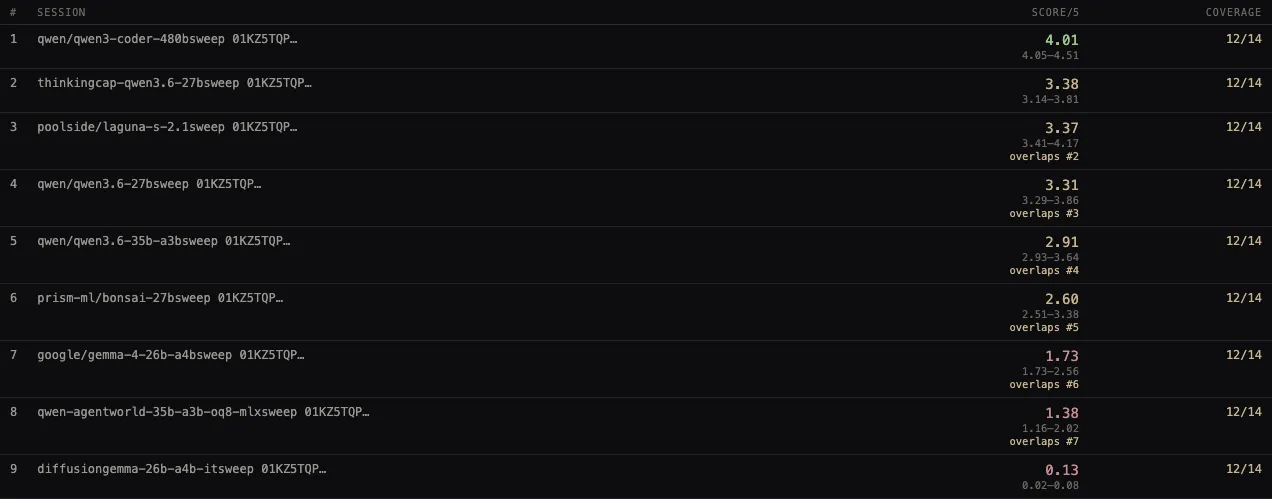
The column says “Score / 5”. That reads like a grade, as though a judge looked at each model’s work and awarded it 4.01 out of a possible 5. That is not what happened. No judge ever scored anything on a five-point scale in this study. Every judgment in the entire run was a comparison between two answers: this one, that one, or a tie.
The five-point number is manufactured afterwards. The fitting code maps each model’s estimated strength through a sigmoid:
where is the fitted log-strength of model and is the mean across the field. (Log-strength is the Bradley–Terry parameter, the quantity whose differences predict who wins a matchup.)
Run that backwards and the score becomes readable. A score of says: against a typical opponent in this field, this model wins about of the time.
| Score | Expected win rate vs. the field | Which model |
|---|---|---|
| 4.01 | 80.2% | qwen/qwen3-coder-480b |
| 3.38 | 67.6% | thinkingcap-qwen3.6-27b |
| 3.37 | 67.4% | poolside/laguna-s-2.1 |
| 3.31 | 66.2% | qwen/qwen3.6-27b |
| 2.91 | 58.2% | qwen/qwen3.6-35b-a3b |
| 2.60 | 52.0% | prism-ml/bonsai-27b |
| 1.73 | 34.6% | google/gemma-4-26b-a4b |
| 1.38 | 27.6% | qwen-agentworld-35b-a3b-oq8-mlx |
| 0.13 | 2.6% | diffusiongemma-26b-a4b-it |
The midpoint of the scale is not 2.5 out of 5 in the sense of “half marks”. It is a 50% win rate: the score of a model exactly average for this field. And the seven rows between second and eighth place span win rates from 52% to 68%.
That reframing is worth sitting with. Rows two through six are all models that beat a randomly chosen rival somewhere between half and two-thirds of the time. Sorted into a column with two decimal places, they look like six distinct tiers.
The overlap annotation is the floor of your doubt, not the ceiling
The tool does something most leaderboards do not: beside each score it prints a bootstrap interval, and where that interval overlaps the row above, it says so. Rows two through eight all carry the annotation. Only first and ninth place do not.
Almost everyone’s first instinct on seeing that is “so those seven are tied.” It is the wrong lesson, and it is wrong in a direction that will bite you.
Overlapping confidence intervals do not imply that two things are statistically indistinguishable. This is a well-documented asymmetry: non-overlap implies a significant difference, but overlap implies nothing at all. Schenker and Gentleman worked the arithmetic out in 2001 and the result is blunt: rejecting the null by the overlap method implies rejecting it by the correct method, but failing to reject by overlap does not imply failing to reject properly. Each interval describes uncertainty about one model’s score. Neither describes uncertainty about the difference, which is the quantity you actually care about, and which is usually estimated more tightly than either endpoint would suggest.
So the overlap annotations are a lower bound on how much doubt you should have. They flag pairs you definitely cannot separate. They are silent about pairs you might have been able to separate, and silent about how badly you cannot separate the ones they flag.
An error bar tells you about one number. Ranking is a claim about the gap between two numbers. Those are different measurements, and only one of them is on the page.
So the intervals cannot settle whether rows four and five are distinguishable. Something else has to.
Where the coin flips actually are
Every pair in this study was judged twice, once with model A presented first and once with the order swapped. That mirroring is standard practice and it exists because LLM judges have a documented preference for whichever answer they read first.
The headline diagnostic reads 13.8%: across 210 mirrored judgments, 29 came back with a different verdict when the sides were swapped.
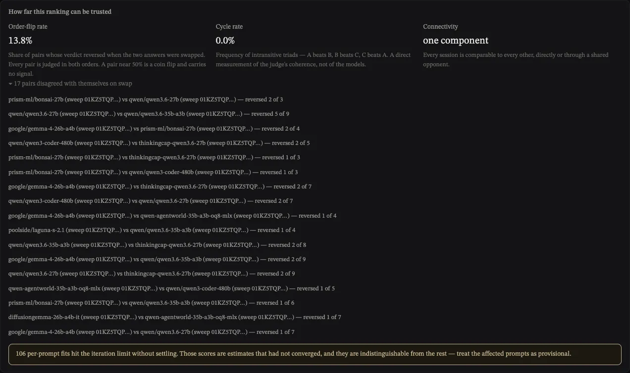
13.8% sounds tolerable. It is a mean, and a mean hides its own shape. Expand the per-pair breakdown and the shape is not tolerable at all:
| Pair | Flipped on swap | Rate |
|---|---|---|
bonsai-27b vs qwen3.6-27b | 2 of 3 | 66.7% |
qwen3.6-27b vs qwen3.6-35b-a3b | 5 of 9 | 55.6% |
gemma-4-26b-a4b vs bonsai-27b | 2 of 4 | 50.0% |
qwen3-coder-480b vs thinkingcap-qwen3.6-27b | 2 of 5 | 40.0% |
bonsai-27b vs thinkingcap-qwen3.6-27b | 1 of 3 | 33.3% |
| …19 pairs with no flips at all | 0 | 0% |
Nineteen of the thirty-six pairs never disagreed with themselves once. That is what drags the average down to 13.8%. Meanwhile one pair reverses more than half the time.
Look at which pair. qwen/qwen3.6-27b and qwen/qwen3.6-35b-a3b sit at fourth and fifth on the leaderboard, 0.40 apart. On the nine occasions the judge was shown both of their answers twice, it changed its mind five times. A verdict that reverses 5 times in 9 is not a weak signal. It is the absence of one.
The rows are adjacent, the scores differ, and the ordering between them was decided by a process that could not reproduce itself.
There is a second thing about that pair, which I missed until I went looking. qwen/qwen3.6-35b-a3b is the judge. Every one of the 960 comparisons in this run was scored by it, including the nine in which it was one of the two answers on the table.
So the least stable verdict in the study is a model judging its own output against a sibling’s and reversing itself more than half the time. That is worth saying plainly and then not over-reading: it is one pair and nine judgments, and the same model placed itself fifth of nine overall, which is not what self-preference looks like. But the run’s worst reliability number and its one obvious conflict of interest sit on the same row, and an aggregate of 13.8% shows you neither.
For calibration: the MT-Bench authors measured GPT-4 agreeing with itself under swapping 65.0% of the time, GPT-3.5 46.2%, and Claude-v1 23.8%, with first-position bias running from 30% up to 75% depending on the judge. By that standard an 86.2% self-agreement rate is good. It is not a fair comparison — MT-Bench deliberately constructed near-identical answer pairs by sampling the same model twice at temperature 0.7, which is the hardest case you can build. Treat it as a rough ceiling on what is achievable, not as a benchmark this study is beating.
The alarming diagnostic that is fine
Underneath the panel sits this:
106 per-prompt fits hit the iteration limit without settling. Those scores are estimates that had not converged, and they are indistinguishable from the rest — treat the affected prompts as provisional.
There are 132 fits in total: twelve prompts times eleven axes. So 80% of them failed to converge. Read plainly, that says four fifths of the underlying numbers are unfinished, which would make the whole table wastepaper.
It does not say that. Here is what is actually happening.
The fit uses minorization–maximization, an iterative scheme that repeatedly replaces the hard likelihood with an easy surrogate and maximises that instead. Hunter established in 2004 that this converges to the unique maximum-likelihood estimate; the convergence rate was pinned down later by Vojnović and colleagues, and it is linear. Linear convergence means the error shrinks by a roughly constant factor per sweep, so the iteration count you need scales with how many digits of precision you demand.
The implementation demands a lot of digits. It stops when the largest change in any model’s log-strength drops below in a single sweep, and it gives up after 500 sweeps.
I reimplemented that exact iteration and ran it on synthetic fields matched to this study’s shape: nine sessions, 72 pairings per prompt, outcomes drawn from a plausible strength ladder with upsets. Across twenty random seeds:
| Measurement | Result |
|---|---|
| Fits converging within the 500-iteration cap | 0 of 20 |
| Iterations actually needed to hit | up to 1,445 |
| Largest score error at the cap, on the 0–5 scale |
Nothing converges in 500 iterations at this problem size. Not just the degenerate cases. Nothing. And the quantity the warning is protecting you from is a discrepancy in the fourth decimal place of a number the interface prints to two.
The warning fires on essentially every fit, and what it is warning about is invisible.
This is a threshold mismatch, not a broken estimator. The tolerance was set to something near floating-point noise; the iteration cap was set to a number that sounds generous and is not. Either raising the cap to a few thousand or relaxing the tolerance to around would make the flag rare again, and therefore meaningful again — which is the entire point of having it.
The one thing the prior already handles
A related worry is worth dismissing explicitly, because it is the first thing a statistician reaches for. In a Bradley–Terry fit, a competitor that wins every comparison, or loses every one, has no finite maximum-likelihood strength. The likelihood just keeps climbing as you push that competitor’s parameter toward infinity. Ford proved the condition for a unique finite solution back in 1957: in every way you could split the field into two groups, somebody in one group must have beaten somebody in the other.
diffusiongemma-26b-a4b-it placed ninth on all twelve prompts. That is exactly the pathological case.
It is already handled. The implementation adds a symmetric prior of half a win and half a loss against a virtual opponent of average strength, which pins the estimate at a finite value and simultaneously fixes the scale. This is the standard remedy and it works. The non-convergence is about iteration count, not about infinities.
The reassuring diagnostic that says less than it looks
Next to the flip rate sits cycle rate: 0.0%, described as “a direct measurement of the judge’s coherence”. Zero intransitive triads: nowhere did the judge decide A beats B, B beats C, and C beats A.
That is genuinely good news, and it is thinner news than it appears, for a reason the source code is candid about. The denominator counts only fully decided triples. If any of the three pairs in a triple ended with the win credit exactly level, the triple is skipped — because an undecided pair cannot participate in a cycle. The comment in the code puts it better than I can: a triple missing a verdict is silent about coherence, not evidence of it.
With nine models there are 84 possible triples. How many were decided is not something the stored record exposes, so I cannot tell you what fraction of that 0.0% is a clean bill of health and what fraction is an empty denominator.
What I can tell you is that transitivity and reliability are different properties. A judge that flips a coin on one pair and is consistent everywhere else will still produce a perfectly transitive ordering most of the time — cycles need three specific disagreements to line up. This study has both: a flawless cycle rate and a pair that reverses 5 times in 9. Neither number contradicts the other, and only one of them is about whether you can trust the ordering.
The score and its error bar are not the same estimator
Now the strangest thing in the table, which took me a while to believe.
Four of the nine scores fall outside their own confidence interval.
| Model | Score | Interval | |
|---|---|---|---|
qwen/qwen3-coder-480b | 4.01 | 4.05 – 4.51 | below its own interval |
poolside/laguna-s-2.1 | 3.37 | 3.41 – 4.17 | below |
qwen/qwen3.6-35b-a3b | 2.91 | 2.93 – 3.64 | below |
diffusiongemma-26b-a4b-it | 0.13 | 0.02 – 0.08 | above |
A point estimate outside its own interval normally means something is badly wrong. Here it means the two numbers were computed by two different procedures that answer two different questions, and nobody noticed they had drifted apart.
The score is the mean of twelve per-prompt fits, each already mapped through the sigmoid. The interval comes from 200 bootstrap resamples of a single pooled fit over all the comparisons at once.
Averaging twelve sigmoid outputs is not the same as sigmoiding one average, and the direction of the difference is not random. This is Jensen’s inequality.
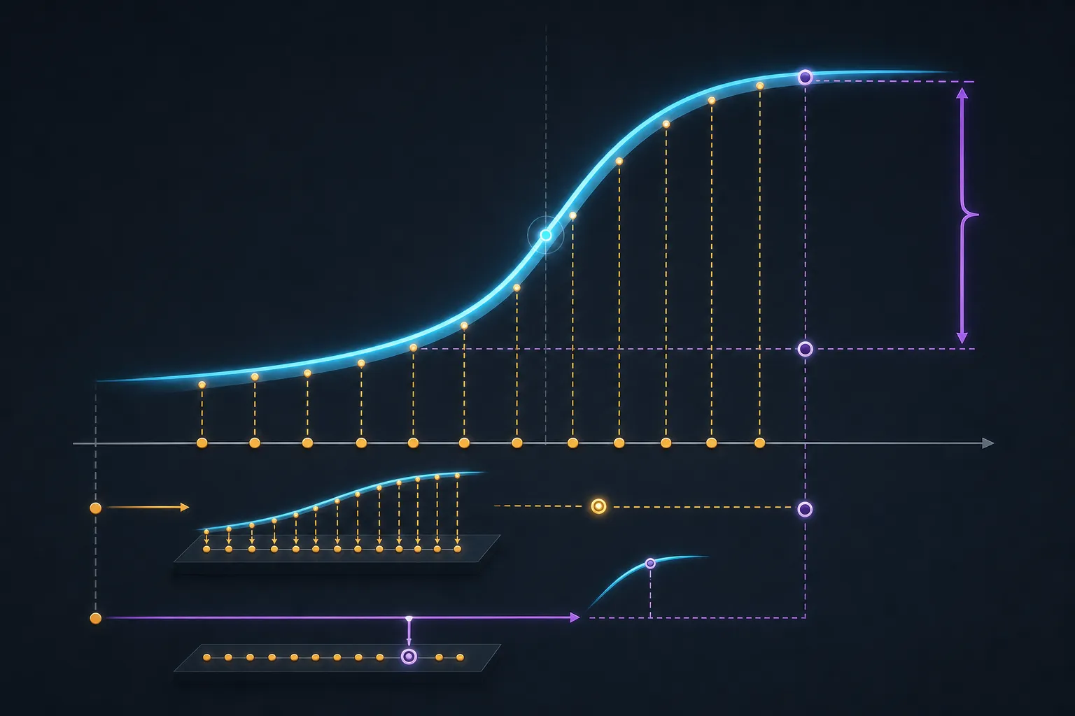 The sigmoid is concave above its inflection point and convex below it, so averaging after the squash pulls strong performers down and weak performers up, relative to a single pooled fit.
The inflection point of sits at a score of exactly 2.50. Above it the curve is concave, so averaging pulls the result down. Below it the curve is convex, so averaging pushes the result up.
| Model | Mean of the 12 scores | Refit from mean strength | Gap |
|---|---|---|---|
qwen3-coder-480b | 4.01 | 4.39 | −0.38 |
laguna-s-2.1 | 3.37 | 3.85 | −0.48 |
qwen3.6-27b | 3.31 | 3.61 | −0.30 |
thinkingcap-qwen3.6-27b | 3.38 | 3.61 | −0.22 |
qwen3.6-35b-a3b | 2.91 | 3.03 | −0.12 |
bonsai-27b | 2.60 | 2.56 | +0.04 |
gemma-4-26b-a4b | 1.73 | 1.60 | +0.14 |
agentworld-35b-a3b | 1.38 | 1.23 | +0.16 |
diffusiongemma-26b-a4b-it | 0.13 | 0.12 | +0.01 |
Eight of the nine rows follow the rule: the five models averaging above 2.50 all show a negative gap, and the three averaging below it all show a positive one.
The ninth is instructive. bonsai-27b averages 2.60, just above the inflection, and its gap comes out positive anyway. It is also the smallest gap in the table, at +0.04. What governs the sign is not where a model’s mean lands but where its twelve individual per-prompt scores land, and bonsai’s are split almost evenly across the inflection: seven above 2.50, five below. The concave and convex contributions very nearly cancel. qwen3-coder-480b has ten of its twelve above the line, which is why its gap is one of the largest.
Nothing is broken. The mean-of-fits and the pooled fit are both defensible estimators; they simply are not the same one, and pairing a point estimate from one with an interval from the other produces a table that appears to contradict itself. The fix is to pick a single estimator and use it for both — or to bootstrap the mean-of-fits directly, which is also the version that would answer the question a reader is actually asking.
What the interval measures, and what you wanted it to measure
One more thing about that interval, which matters more than the mismatch.
The bootstrap resamples individual comparisons, drawing 864-odd judgments with replacement from the same pool. So it answers: if this same judge re-judged this same set of prompts, how much would the score move?
The question you had was almost certainly: if I had picked twelve different prompts, how much would the score move?
Those are wildly different quantities, and the second is much larger. Judgments within one prompt are correlated: they are all reacting to the same task, and a model that misreads that task loses most of them together. Resampling individual observations instead of whole clusters is the textbook way to understate variance in exactly this situation, which is why the cluster bootstrap exists. Resample twelve prompts with replacement instead of 864 judgments and these intervals would get conspicuously wider.
The two results
Strip out everything the study cannot support and this is what is left.
qwen/qwen3-coder-480b is above this field. It scored top-two on eight of the twelve prompts and never fell below fifth. Its interval clears the next model’s. Its worst flip rate against any single opponent is 40%, and against most of the field it is zero. This one holds. It is also, at 480 B total parameters against a field whose next largest entry is Laguna S 2.1 at 118 B, roughly the result you would have predicted without running anything.
diffusiongemma-26b-a4b-it is below this field. It placed ninth on all twelve prompts without exception. There is no ambiguity anywhere in the data. There is also no news in it: Google ships DiffusionGemma as an explicitly experimental discrete-diffusion model, documents it as scoring below Gemma 4 on benchmarks, and recommends Gemma 4 wherever output quality matters. The leaderboard’s one unambiguous separation is a fact you could have read off the model card.
Between those two: seven models spanning win rates of 52% to 68%, with adjacent pairs whose verdicts reverse up to 5 times in 9. That is a band, not an order. Twelve hours of judge time bought a clean confirmation of the two things that were already obvious, and could not resolve the seven-way question in the middle that was the reason to run it.
That is not a failure of the study. Twelve prompts and 960 comparisons is a small experiment, and this is what small experiments are entitled to conclude. The failure mode would be reading the sorted column as though it had concluded more.
What to do with your own leaderboard
Find the flip rate for the specific pair you care about. Not the aggregate. The aggregate is a mean over pairs and it will look fine while the one comparison driving your decision is a coin toss. If your tool does not break the rate down per pair, that is the first thing to add.
Treat “the intervals overlap” as a lower bound on doubt. Overlap does not establish a tie, and non-overlap only establishes a difference. If you need to know whether two models differ, estimate the difference directly rather than eyeballing two error bars.
Check what the interval resampled. If it resampled judgments, it is telling you about judge noise. If you want to know whether your result survives a different prompt set, which is nearly always the real question, it has to resample prompts.
Check what a convergence warning is thresholded at before you let it scare you, and check what a coherence statistic put in its denominator before you let it reassure you. In this study those two diagnostics point almost exactly opposite to how they read.
Ask what the top and bottom rows cost you. If both are things you knew before you started, the study’s real output is the middle, and the middle is where the power ran out.
References
- Schenker & Gentleman (2001), “On Judging the Significance of Differences by Examining the Overlap Between Confidence Intervals” — The American Statistician 55(3):182–186; the asymmetry between overlap and non-overlap
- Zheng et al. (2023), “Judging LLM-as-a-Judge with MT-Bench and Chatbot Arena” — position bias and the swap-consistency figures in Table 2
- Hunter (2004), “MM algorithms for generalized Bradley–Terry models” — Annals of Statistics 32(1):384–406; the iteration used here, and its convergence to the unique MLE. It does not characterise the rate
- Vojnović, Yun & See (2020), “Convergence Rates of Gradient Descent and MM Algorithms for Generalized Bradley–Terry Models” — AISTATS 2020; the linear convergence rate
- Ford (1957), “Solution of a Ranking Problem from Binary Comparisons” — American Mathematical Monthly 64(8):28–33; the strong connection condition for a finite Bradley–Terry MLE
- Deen & de Rooij (2020), “ClusterBootstrap” — Behavior Research Methods 52(2):572–590; why resampling observations rather than clusters understates variance
- DiffusionGemma model overview, the model card for the benchmark comparison against Gemma 4, and Google’s announcement post for the recommendation to prefer Gemma 4 where quality matters
- Qwen3-Coder-480B-A35B-Instruct — parameter counts for the top-ranked model
- Poolside — Laguna models — the 118 B figure for the next-largest model in the field
The ranking record, the fitting code, and the judge rubric discussed here are from a private evaluation harness on my own machine and are not linkable. Every number attributed to them is reproducible from that record; the convergence figures in the table above come from my own reimplementation of the published iteration, run on synthetic fields matched to the study’s shape, not from the study’s own fits. References 1 and 6 refuse automated fetching and need a browser.